The Challenge: A Refined Practice With a Dated Digital Presence
The care inside the office had evolved. The website had not. Before a single page was designed, our team had to close the gap between a premium in-office experience and an online presence that undersold it at every turn.
An Outdated Look for a High-End Practice
The previous site read as a standard dental website. For a practice positioned as a spa-like destination for discerning Manhattan patients, that mismatch created hesitation. Prospective patients arriving from a Google search had no visual reason to believe the experience would be any different from the office down the street.
Stock Imagery in a Deeply Personal Business
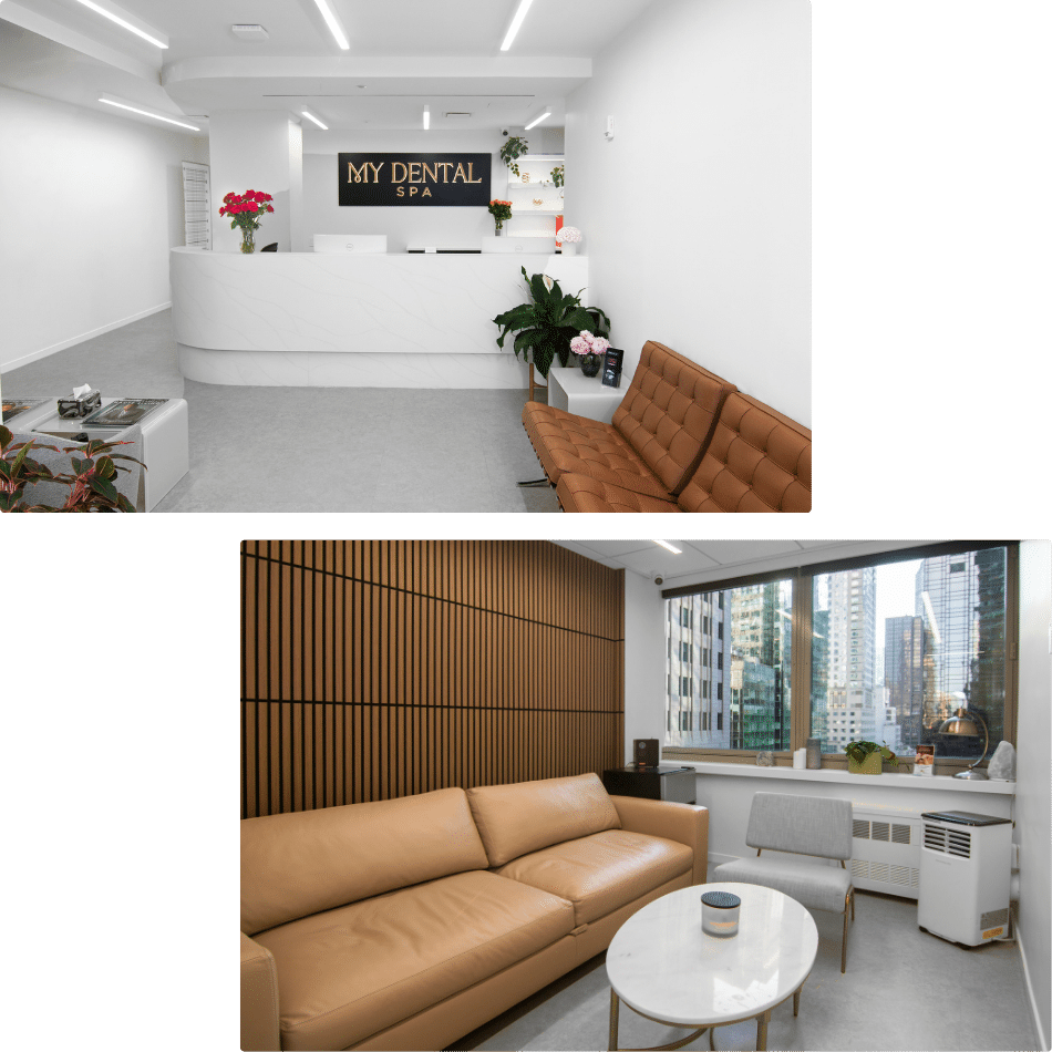
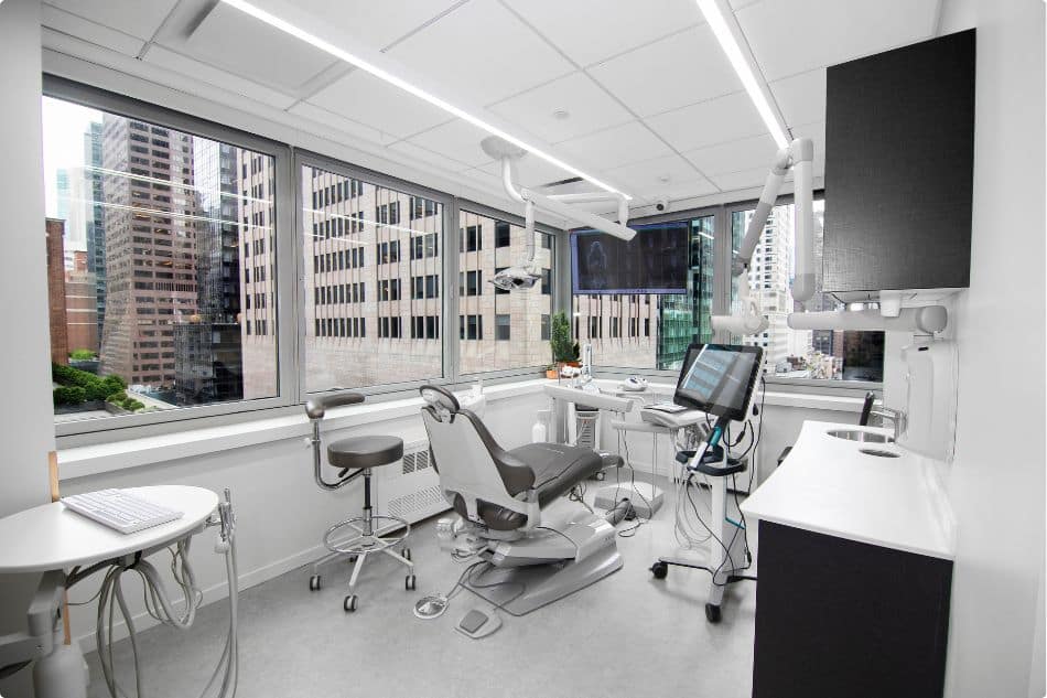
The site leaned heavily on stock photography. Generic smiling models tell a visitor nothing about the office they are considering, and patients researching a high-end practice want to see the actual space and the actual doctor. There was no sense of place and no sense of who would be treating them.
No Consistent Design Standards
Fonts, colors, button styles, and spacing varied from page to page. Without a defined system, each page felt like it belonged to a slightly different practice. That inconsistency quietly erodes trust, especially for a brand whose entire promise is attention to detail.
The Solution: A Calm, Confident Design System
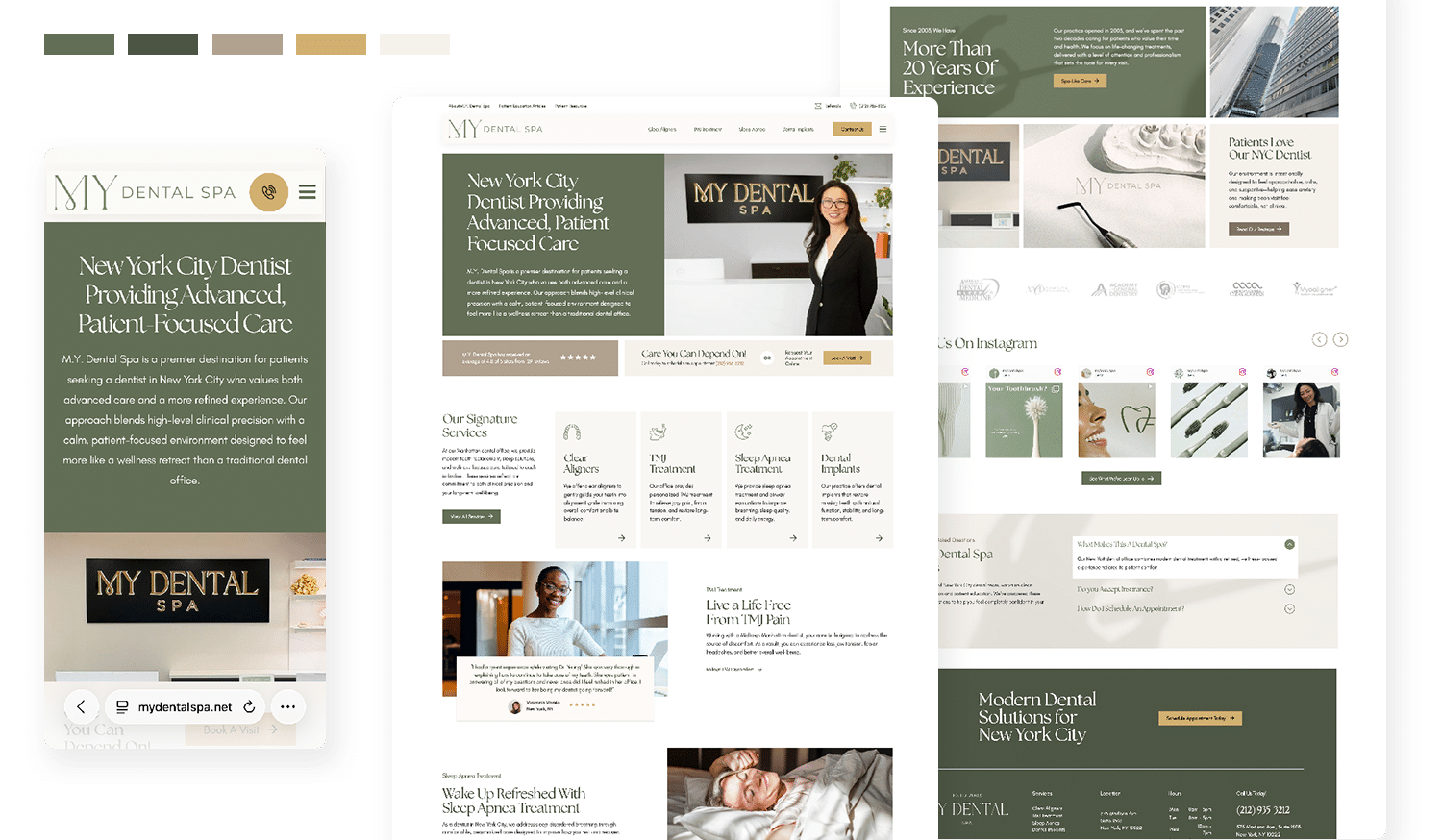
A dental spa website should feel like the office it represents. Every decision we made, from the palette to the photography to the navigation order, was designed to give visitors the same sense of calm and precision that patients experience in Midtown.

A Refined Palette and Typography
We built the design around muted sage and deep forest greens, warm gold accents, and soft neutral backgrounds. An elegant serif carries the headlines while a clean sans serif keeps body copy highly readable. The result feels expensive without feeling cold, and it reads clearly on a phone screen, which is where most local searches begin.

Custom Photography With a Sense of Place
We replaced stock imagery with custom photography of the lobby, the treatment space, the signage, and Dr. Yeung herself. Visitors now see the room they will sit in and the person who will treat them before they ever pick up the phone. Those images do more conversion work than any headline on the page.

A Design System That Holds Together
We established a single set of standards for headings, buttons, cards, spacing, and image treatment, and applied it across all templates. Service pages, article pages, and the contact page now share the same visual language. That consistency makes the site easier to navigate and far easier to expand as the practice adds content.

A Structure Built Around TMJ and Sleep Apnea
The practice wanted to grow its TMJ and sleep apnea care, so we gave those services top-level placement alongside clear aligners and dental implants, rather than burying them in a long list of services. Each one received a dedicated page with its own search-optimized content, supported by homepage sections that speak directly to jaw pain, headaches, and disrupted sleep. Patients searching for those problems now land on a page written for them.
Why Consistent Branding Matters
Patients form an impression of your practice long before they meet you. A website that looks dated, inconsistent, or interchangeable with every other office in your market invites them to keep looking. A site that is designed with intention does the opposite. It gives people a reason to trust you, a clear picture of what to expect, and an easy way to take the next step.
Luxury Dental Website Design FAQs
Practices positioned at the high end of their market face a different set of design problems than a general family office. Here are a few questions we answer most often for doctors considering a redesign.
Ready for a Website That Reflects Your Practice?
Pro Impressions Marketing combines brand identity development, custom website design, and technical SEO to build sites that attract the patients you want and convert them into appointments. You can see the finished project at mydentalspa.net. When you are ready to talk about yours, our team handles the strategy and execution so you can stay focused on dentistry.