I recently came across a dental office with a logo that looked like an architect’s concept sketch for a classic Victorian home. Their office was in such a beautiful building, that I understood how they would want to incorporate the house in their brand identity, but the execution made me cringe. The image itself was as beautiful as the home-turned-dental office, but as a brand mark (aka logo), it was highly problematic. If your office’s logo violates the following principles and resembles any of the following fictitious dental office logos, in addition to rebuilding your website as part of your premium marketing package with Pro Impressions Marketing, allow us to refresh your dental brand as well. It will enhance your marketing results and case acceptance in ways that you may not even be able to imagine.
Principle 1: Simplicity
Every iconic brand you can probably think of shares 1 principle: simplicity. The more elements in a logo, the less likely it is that you’re communicating only the things for which you want your office to be remembered. In the case of the Victorian house, there’s probably a reason the dentist decided that this building would make a great office, such as a feeling of elegance or sophistication. By showing shingles and windows, and doors, the number of elements confuse this message.


Dental Logo Design Principle 2: Scalability
Most dental logos that violate the logo simplicity principle will inherently fail in scalability as well. Things like taglines are the first elements that become illegible as the logo shrinks down to an icon such as a desktop shortcut or even embroidery on a shirt. These are telltale signs that your dental office’s logo is not scalable.


Logo Design Principle 3: Memorability
Even simple logos can be forgettable, but complexity doesn’t help solve that issue either. Generic words and concepts blend in with the branding noise of the industry. This can literally send a patient to the competition, and if the patient shrugs and says, “Meh, oh well,” you’ve really got a brand identity problem.

Principle 4: Versatility
Dentists with logos that fail the versatility test are most likely to say something like, “Yeah, but it looks great burned into the large oak desk in our lobby,” or “But it’s etched on our front window!” Or, “but all of our letterhead has a blue banner at the top and our patients love it!” While all these specific statements may be absolutely true, it doesn’t mean that the brand mark should continue to perpetuate as the centerpiece of your dental office’s brand identity. It’s time to evolve and create a related, refreshed logo that takes the things you love about it (or the emotions you want patients to experience upon their first impression with your office) and incorporate them in a new logo design. The new design, when created with versatility in mind, will work everywhere and will look great doing it!


Principle 5: Timelessness
That Sunrise Dental logo gave me some 80s nostalgia, perhaps reminding me of an old Folgers ad or something, and that brings to mind the last principle that complex dental office logos often violate: they can be super dated. This can happen naturally over time as the doctor is reluctant to part from a logo that is so distinctive—it’s on their building, their coats, everything! And everything needs to be updated because very few logos are actually timeless, even when they aren’t complex. But with complex logos, each element starts to show its age and, before long, you have a very dated brand identity.

Consider how Allan Peters Presented Sherwin Williams’s logo in a reimagined design:
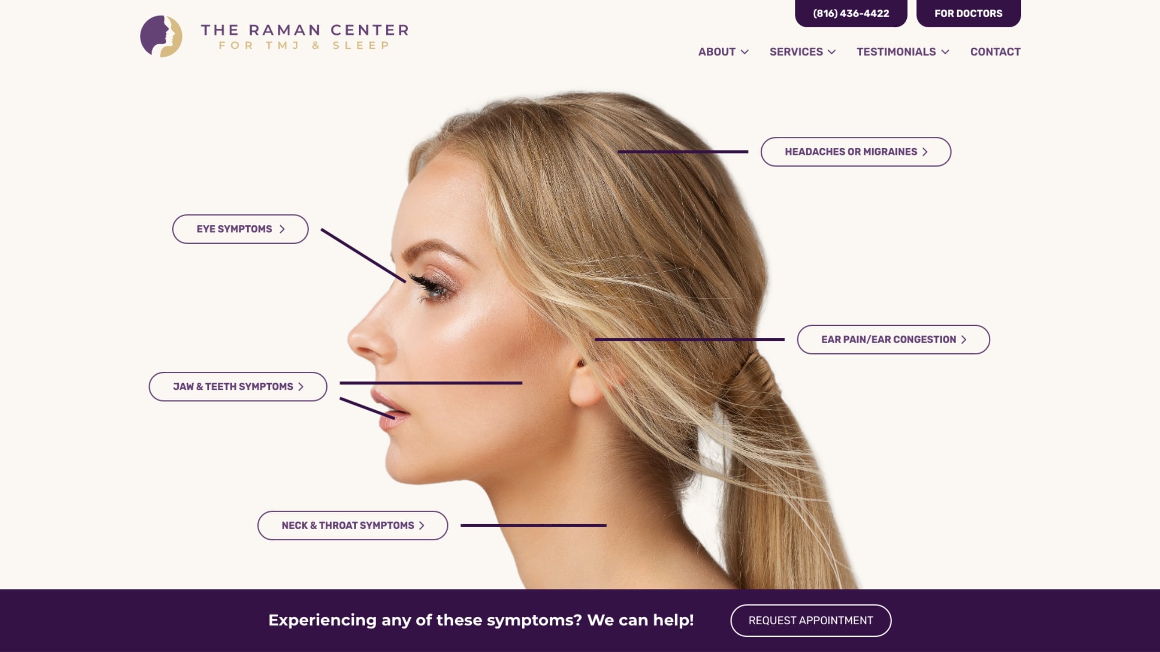
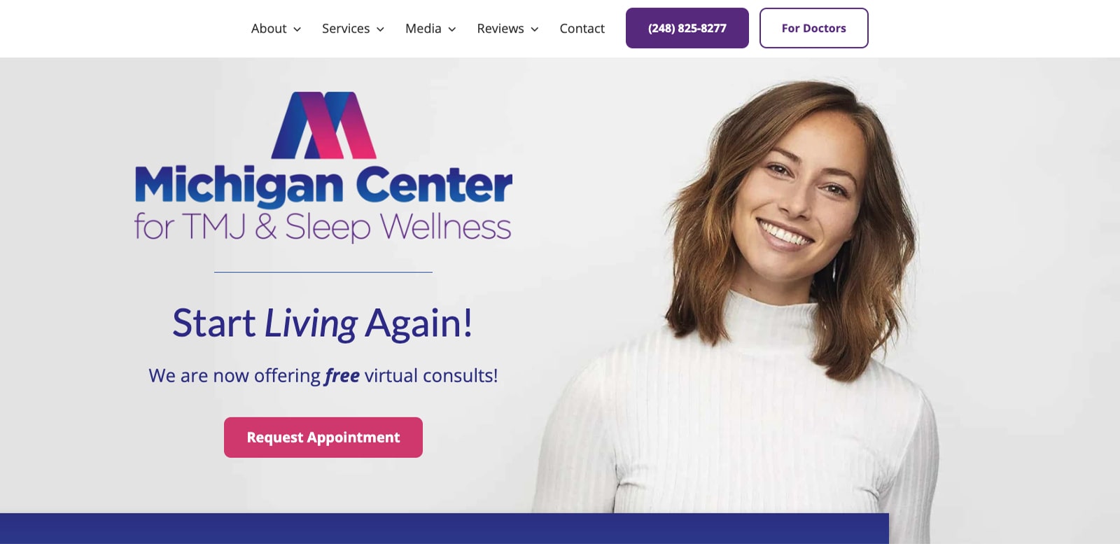
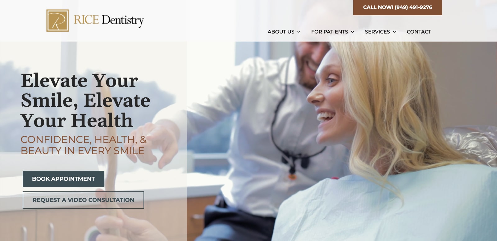
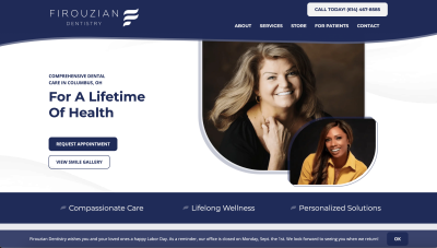
Is Your Dental Logo Holding Your Practice Back?
Your logo is often the first impression a patient has of your practice, and if it feels outdated, overly complex, or difficult to recognize, it may be working against your marketing without you even realizing it. A refined, modern logo does more than improve aesthetics—it strengthens your brand identity, builds trust faster, and supports higher case acceptance by presenting a polished, professional image from the very first interaction. The most effective designs follow a simple philosophy: “Simple, functional, and holds all the brand equity.” I agree—it looks great, and we’d love to do the same thing for your dental office.
At Pro Impressions Marketing, we don’t just redesign logos—we refine what already works while removing what doesn’t, creating a clean, versatile, and memorable brand mark that performs across every platform. If your current logo no longer reflects the quality of your practice, now is the time to evolve. Schedule a call today to discover how a strategic brand refresh can elevate your marketing results and help you stand out in a competitive market.


