Branding and Website Design
Family Smile Centers serves patients across St. Charles County with comprehensive family, cosmetic, implant, and orthodontic care. The new leadership wanted to preserve the practice’s community roots while creating a modern brand that would carry them confidently into the next chapter.
Objectives
Our goal was to rebuild both the brand and website to reflect a new era of care, while preparing for long-term scalability.
- Develop a new, family-friendly brand identity under new ownership
- Build a website framework ready for multiple future locations
- Simplify navigation and improve appointment conversion paths
- Update messaging to reflect warmth, comfort, and trust
- Improve SEO and visibility across St. Charles County
Services Utilized

Website Design
Complete rebuild with mobile-first UX and modular design for future expansion.

Branding & Logo Design
A new visual identity has been developed around modern colors, strong typography, and a welcoming tone.

Dental SEO
On-page and technical SEO setup to improve local visibility and long-term ranking potential.

Copywriting
Clear, patient-friendly messaging highlighting the practice's values and services.

Online Reputation Support
Integrated reviews and social proof to build community trust and reinforce the brand promise.
Trusted Design, Proven Results
This rebrand and website redesign helped transform a legacy practice into a modern, multi-location-ready dental brand. The new design system aligns with the practice’s mission—making high-quality dentistry accessible, comfortable, and family-oriented—while improving performance and conversions.
Immediate outcomes include:
- Significantly improved site navigation and mobile experience
- Clearer calls-to-action leading to more appointment requests
- Consistent, modern visuals across all digital and physical branding
- Future-proof website architecture for expansion
Modern Branding & Aesthetic
Our creative team developed a clean, modern identity built around the tagline:
“Modern Dentistry. Lifetime Comfort. For Every Family.”
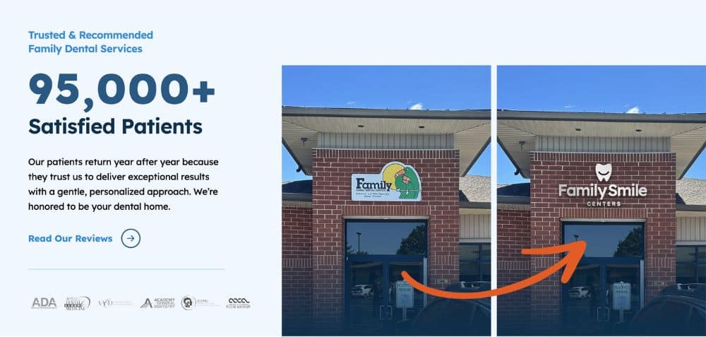
The updated logo, color palette, and typography create a warm yet professional impression—perfectly representing a practice trusted by generations of families.
Brand System Highlights
- Logo: Simplified tooth icon and confident type treatment for easy recognition across signage and web.
- Color Palette: Deep navy (#285882), sky blue (#69B4F6), and bright orange (#E25B25) communicate trust, clarity, and energy.
- Typography: Lexend font family improves readability and accessibility across all devices.
Website Experience
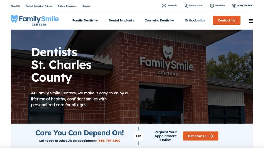
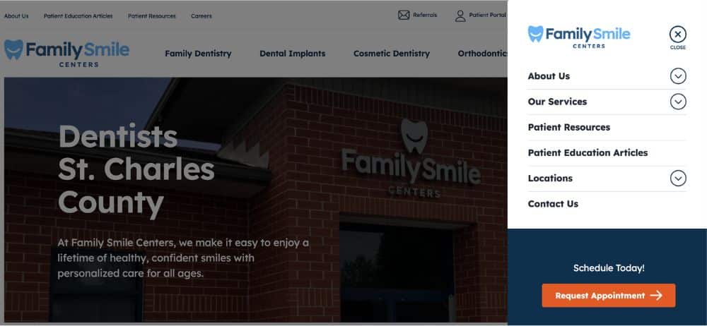
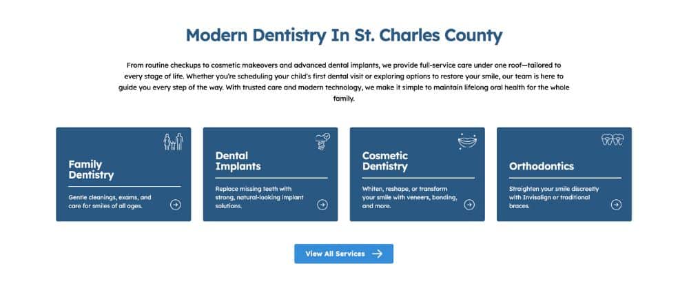
We designed the site around a modern, family-focused layout with streamlined navigation and clear entry points to our core services: Family Dentistry, Dental Implants, Cosmetic Dentistry, and Orthodontics.
Each page features patient-first messaging, optimized service summaries, and visible CTAs such as “Get Started” and “Request Your Appointment.”
User Experience and Scalability
One of the project’s biggest challenges was preparing the site to support multiple future locations while maintaining brand consistency.
Our development and content architecture make that simple. Each new office can be added seamlessly with its own page, local content, and integrated reviews—without disrupting the overall structure.
The new website now features:
- Clear navigation for faster patient journeys
- Modular layouts for flexible service and location additions
- Embedded Google reviews for social proof
- Local SEO enhancements for city-specific searches
Why the New Branding and Website Are Better
The previous website’s outdated visuals and structure didn’t reflect the quality or modern approach of the new ownership. The refreshed brand and web presence now highlight the practice’s commitment to clarity, community, and comfort—values patients experience from their first online interaction.
Key improvements:
- Clean, modern layout that performs across all devices
- Messaging that feels personal and welcoming
- Improved appointment flow and accessibility compliance
- Future-ready foundation for growth and additional offices
Visual Highlights
- Desktop and mobile homepage views featuring clear CTAs and strong hero messaging
- Color and typography system showcasing Lexend fonts and warm blues/orange
- Responsive layouts that adapt seamlessly across devices
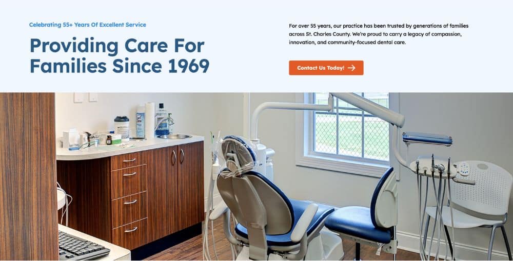
- Modular service cards and testimonial blocks for clean readability
The Process
Discovery
Brand workshops with the new doctor-owner to define positioning, patient experience, and visual direction.
Design
Creation of logo suite, color palette, typography, and modular UI system.
Development
Responsive site build optimized for accessibility, SEO, and long-term scalability.
Launch
QA testing, analytics setup, and CMS training for easy updates and future expansion.
From Legacy Practice to Modern Family Brand
Family Smile Centers’ transformation shows what’s possible when branding, design, and marketing strategy align. The new identity reflects a trusted, community-centered practice poised for growth—while the website offers a seamless, welcoming digital experience for every visitor
Ready to redefine your practice’s digital identity?
Let’s build your next success story.
